By Erin Hamalainen, Head of Data Analytics & Insights, The Fred Hollows Foundation
When The Benchmarking Project embraced Power BI as their delivery platform, I was super excited. I knew what type of gems we could find in a tool like that.
But I know Power Bi can feel intimidating to some, especially when data isn’t your main skillset or you may not be familiar with interactive visualisation tools (and are scared you might break something!).
The good news is that you don’t need to be a data expert to use Power BI. Also, you can’t break the reports, promise (unlike that time you sorted the 1st column in an excel spreadsheet and regretted it forever).
Below I’ve pulled together a list of the best features of Power BI, how they work and what you can use them for. For more information you can refer to the Microsoft User guide here https://learn.microsoft.com/en-us/power-bi/consumer/ or the recording of the Power BI demonstration by TBP here.

Beginner Level
1. Accessing Power BI
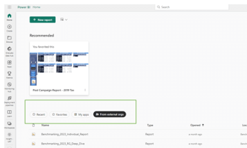
If you have your own Power BI Licence, you can access your Benchmark reports via the “From External Orgs” link on the homepage. One benefit is you can remain logged in as your organisation while accessing the Benchmark reports within the Slingshot environment.
2. Menu Bars
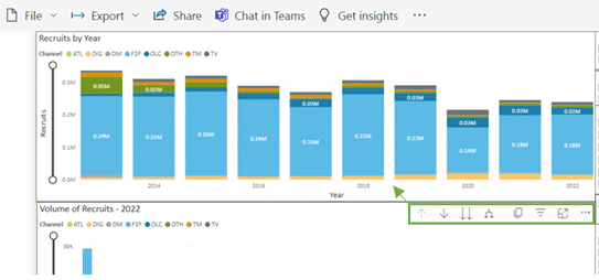
The Power BI Report Menu Bar is found at the top of the reports and is enabled with a few key features – the items highlighted below are discussed later in the article. For now, take note that I refer to this as the ‘Report Menu Bar’.

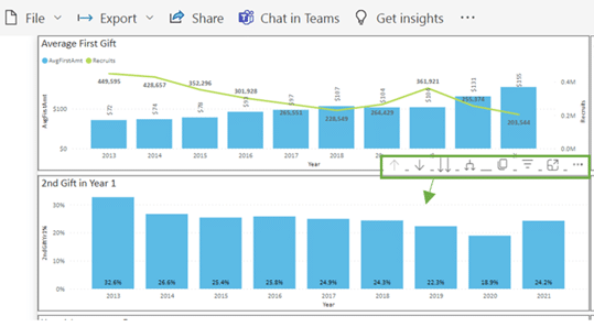
The Visual Menu Bar can be found either at the top or bottom of individual visual. This will differ depending on the layout of the report and if the visual is at the top or bottom of the page. The menu bar will appear when you hover your mouse over the visual. If the menu keeps hiding itself when you move to click a button, just click on the blank space in the visual and it will remain highlighted.
3. Everything is interactive
One of the reasons I love Power BI is the interactivity users have with the report. In most cases, you can click on any part of the report, and it will filter that page or visual by that value.
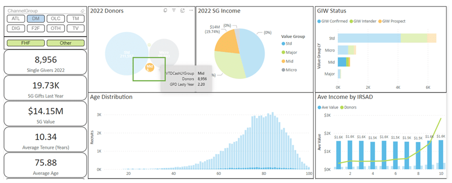
For instance, the below SG 2022 Donor Profile tab is filtered by the Mid Value classification. This means that we can look at donors that sit just within that classification and see what their average gift is, their age distribution and other metrics on the page of just that cohort.
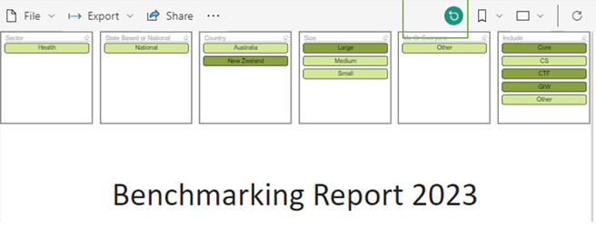
4. Reset to Default
The Reset to Default button is your best friend.
Power BI has some amazing functionalities, but sometimes you can get lost in the layers of data or filtering options. While this is especially true when starting out, I still find myself using this button the most when using a report as it’s the fastest way to reset the filtering and start again.
If the report is at the default mode, the button will be grey, and you won’t be able to select it. As you start moving through the filtering or drill down options it will highlight green. You can press it any time to ‘reset to default’.
Intermediate Level
Now you have the basics under your belt you can start playing with the report. This is where the fun begins (and don’t worry if you get lost. Just reset to default and start again!).
5. Slicers
Throughout the Benchmarking reports you will see blocks of slicers that filter in and out data selections and change the data views.
Have you ever created/used Excel reports with pivot tables and used the filter function or a slicer box? That’s pretty much what slicers are in Power BI. Buttons that enable filtering of the data.
Slicers can be used to align benchmarking numbers with the way you classify your fundraising programs (i.e. Mid Value donors), or only include channels your charity invests in.
The slicers with the green background are views. This will change the data on the X or Y axis of the table as per the definition of the selection.

The slicers with the blue background are filters, this will limit the data that you view in the visual.

Slicers can be selected individually (like the above) or you can select multiple values in the same sliver box (like below) by holding down the Ctrl button on your keyboard.

6. Drill down
In most visuals throughout the report, you can drill down or up to look at the data in different ways. Think of this option as moving up and down through levels of data. This will of course differ depending on the visual at hand, the best way to get to know what’s in there is to just play around.
There are 4 main drill options, and all of these are accessible via the Visual Menu Bar.
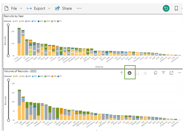
a. Drill-down icon
This arrow will highlight with a grey circle when you select it. Once it’s highlighted you can click on a data point within the visual its selected and drill down into that metric.
In the example below we have used the drill down icon to look at Recruits for 2020 vs 2022.
Note: This action will also filter any other visuals on the same page by the selected value – however there are minimal pages that allow this interaction within the Benchmarking report.
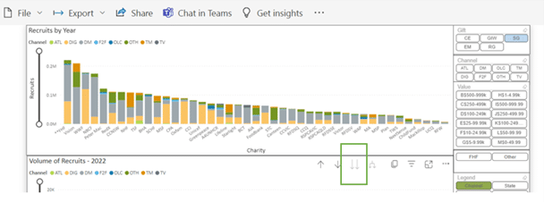
b. Double arrow drill-down icon
This arrow will highlight with a grey circle when you select it. Once it’s highlighted you can click on a data point within the visual its selected and drill down into that metric.
In the example we have used the drill down icon to look at Recruits for 2020 vs 2022.
Note: This action will also filter any other visuals on the same page by the selected value – however there are minimal pages that allow this interaction within the Benchmarking report.
c. Expand down icon

The Expand icon is a combination of the above two icons. It will drill down to the second level while keeping the detail of the first level.
In the example we can see acquisition by year and charity over time.
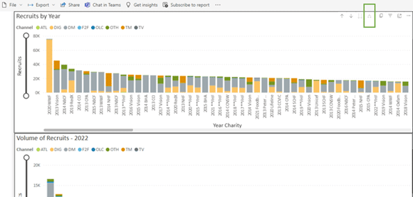
d. Drill up icon
Once you drill down into any visual, the drill up icon will be enabled, and you can go back up when you are finished perusing the data (or you can just hit the reset to default button)
7. Tool tips
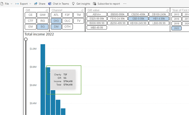
In Power BI, there is a function called ‘tooltip’ which allows the creator (Slingshot in this case) to add different data fields into a box that will display all the numbers selected when the user (you) hovers your mouse over the content. This feature is useful when you can’t quite eyeball the bar value against the axis or would like to know the exact number the bar represents.
The feature is scattered throughout the report and has been built to showcase different numbers. The example below is from the Income by Charity page and allows us to see the total income against the bar that the mouse was held over.
8. Focus mode
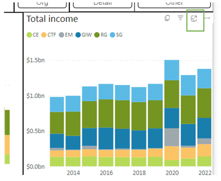
The Focus Mode button can be found in the Visual Menu Bar.
This button will blow the visual up to full page size and can be useful when viewing complex graphs or presenting the report for an audience.
Advanced Level
Now you know how to move around the report and find the golden insights, here are a few advanced skills to help you use or share the knowledge to a wider audience.
9. Export data to Excel
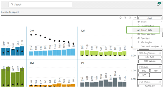
The Export Data option can be found in the Visual Menu Bar. Exporting the data to excel can help when creating strategic plans (see the other article here) or when doing a deep dive into your organisation’s analytics. Sometimes people just prefer to look at data in excel and that’s okay too.
To export the data, go to the Visual Menu Bar and select the […] button > Choose Export data.
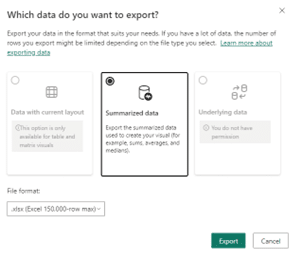
You will be presented with a second screen where you can then select Export. The report will only allow you to export in the summarised view. Save the file as per usual and away you go.
10. Show as a table
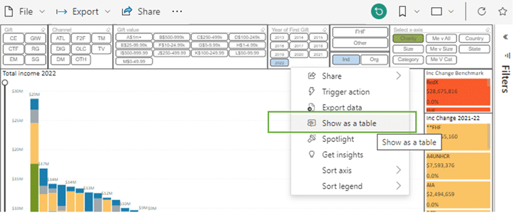
Some people may just prefer data tables to the fancy visuals – The good news is you can have both! Maybe you want to look at the numbers but don’t want to go to the hassle of exporting to Excel?
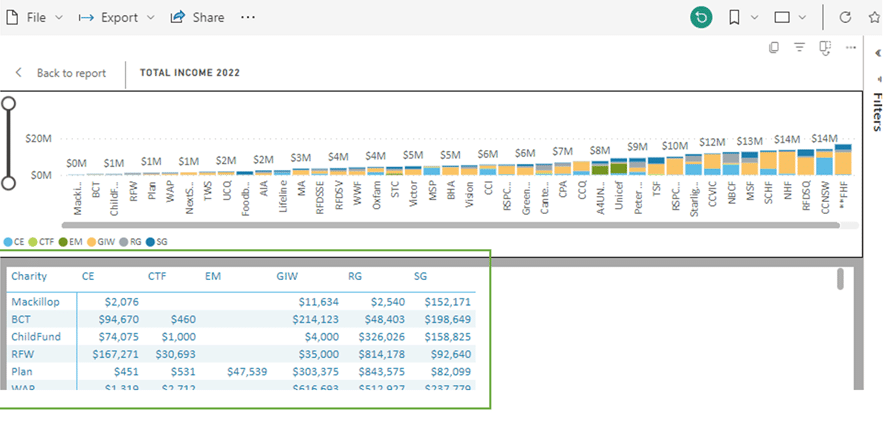
To view the data as a table, go to the Visual Menu Bar and select the […] button > Choose Show as a table
The below is an example of what the data will look like.
11. Bookmarks
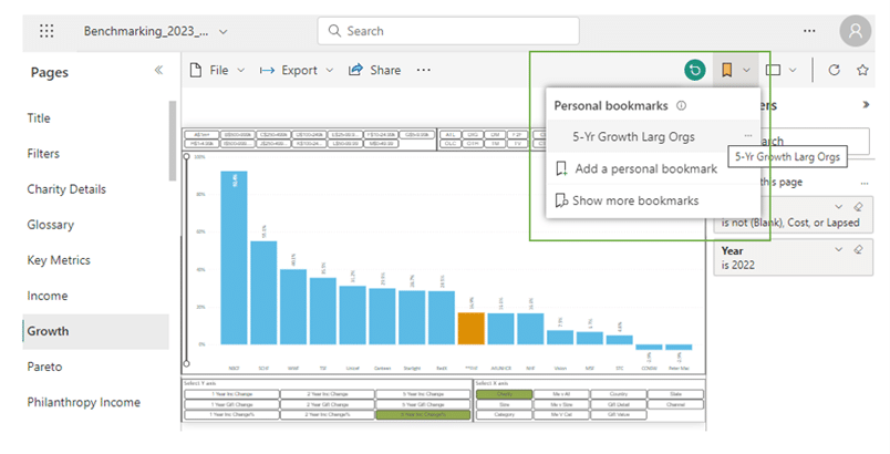
Power BI has a cool feature to create personalised bookmarks from the Report Menu Bar.
A bookmark will save the report in a state you have changed from default, for instance you may have used some of the slicers / filters to see the data in a certain way. This can be useful for quick referencing back to that view or planning for a presentation so you can quickly jump between the visuals you want to talk about.
To create a bookmark, first ensure you are on the report page with the desired filters applied. Go to the Report Menu Bar > Select the Bookmark Flag icon > Select ‘Add a Personal Bookmark”.

Choose a name for your bookmark and hit save (we don’t recommend you saving a bookmark as a default, although there is the option to do so.)

The bookmark will now be available under your personal bookmarks for whenever you want to review the data in the future.
12. Right-click on visual
There are a few cool options available when you right-click directly on a visual that can help when looking at the data.
Go to the Report Menu Bar > Select the Bookmark Flag icon > Select ‘Add a Personal Bookmark”.
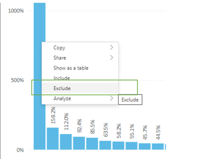
a. Exclude
You can exclude single points of data in a visual by right-clicking on the bar (or other data point) and selecting ‘Exclude’. This can be useful to remove outliers without having to use the filters or slicers.
b. Copy image
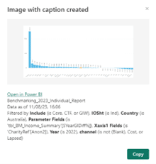
You can copy a visual from the report with an active hyperlink and associated filtering criteria which can be helpful for static reports or to refer to a particular visual at a later stage.
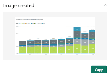
Right-Click on the visual and select or Copy > Image with caption.
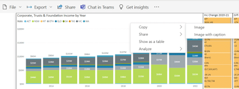
For both options you will need to wait a short time for the image to generate and then select the copy button on the pop out box.
13. Export to PowerPoint / PDF
If you’ve made it this far through the article and are wishing for the old days of static paper reports, then you’re in luck.
Power BI gives us the option to export the report as either a PDF or a PowerPoint if the need arises. This can be handy to share the report with team members who may not have the skills to use Power BI (yet). It can also help when preparing Board or ELT presentations as this option gives a quality image for export.
The Export option is found in the Report Menu Bar, and you can choose either PDF or PowerPoint (excel has been disabled for these reports).
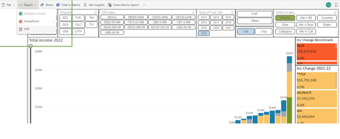
Once you select the export format you will be given the option to export Current Values (meaning with any filters that you have on the report) or Default Values of the report, alongside exporting just the current page or whole document (if current page is not ticked).

Conclusion
Hopefully these tips and tricks will help you get even more value out of the Benchmarking Reports. Remember, the best way to learn is to use the report. Play around and press all the buttons! With time you will become more comfortable with how the interactivity works. And if ever you need further assistance, you can always reach out to the team at The Benchmarking Project!
If you’d like to get in touch with Erin to discuss further, please connect with her via LinkedIn at: Erin Hamalainen | LinkedIn
